
Logo Meaning
Discover the philosophy and vision behind KITIM's logo.
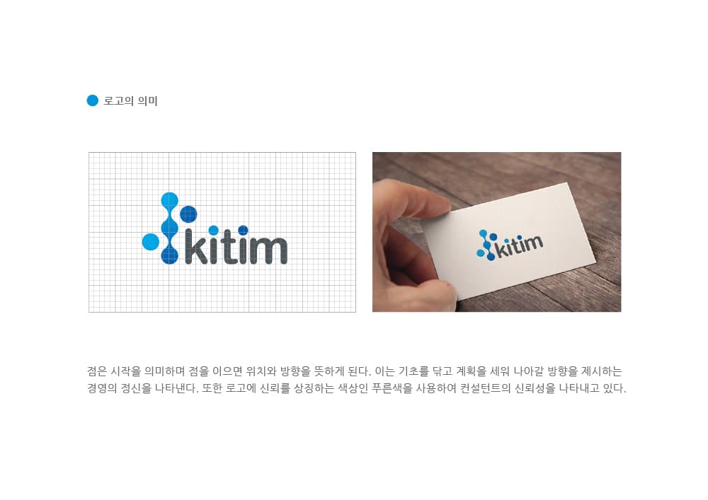
Philosophy Behind Our Logo
Meaning of the Dot
A dot signifies the beginning, and connecting dots creates position and direction. This represents the spirit of management — laying foundations, making plans, and charting the way forward. KITIM embodies the commitment to start at the company's origin point and guide businesses toward their goals through systematic planning and strategy.
Meaning of Blue
The blue color in our logo symbolizes trust, representing the reliability of our consultants. As a consulting partner that accompanies businesses through critical growth phases, it embodies our promise to build long-term partnerships with clients based on unwavering trust and expertise.
Meaning of KITIM
KITIM stands for Korea Institute of Technology Innovation Management. With Technology, Innovation, and Management as our core values, we provide comprehensive support for strengthening corporate technology competitiveness and driving management innovation.